My role
Lead Design and Research
Main tools
Figma, Google Analytics, Wordpress, PowerBi, Miro.
Responsabilities
UI/UX Design, Project Management, Accessibility champion, Quantitative and Qualitative research.
Time
Jul 2023 - Aug 2024
The What?
Found and solved a technical issue preventing user from using Help Centre. Redesigned the Help Centre to address accessibility, usability, and engagement challenges. The project introduced a new navigation system, and enhanced the overall user experience with a cleaner and more intuitive interface that is more accessible.
The Why?
Research revealed the Help Centre was hard to navigate, difficult to access, and underutilised. Many users struggled to find relevant information, and technical issues often blocked access. This decreases customer satisfaction and increases Account Manager's workload.
The How?
We analysed Google Analytics and user surveys to understand the core issues, followed by accessibility audits to identify barriers. Lo-fi prototypes and user testing were conducted to refine the interface and navigation. A parallel site strategy allowed for uninterrupted service during the pilot phase, and backend metrics, along with user feedback, informed iterative improvements to ensure a seamless, user-friendly Help Centre.
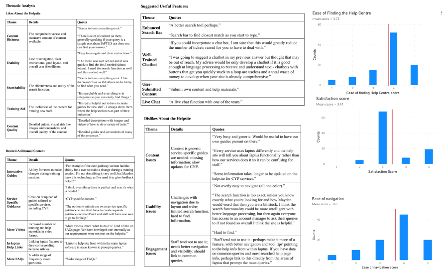
Through our feedback platform, UserVoice, we identified recurring complaints from users about our Help Centre. The most common issues were described as "hard to use" and "can’t find what I’m looking for." These frustrations not only impacted user satisfaction but also added to the workload of our Account Managers (AMs), who recognized the need for improvement to better support both users and their own roles.
While initial suggestions included redesigning the Help Centre and implementing a chatbot, we realized these solutions might only address surface-level symptoms rather than the root causes. To ensure our efforts truly solved the underlying problems, I conducted thorough research to better understand the challenges users were facing.
Google Analytics
To gain an initial understanding of the Help Centre’s performance, I examined the quantitative data readily available through Google Analytics. This provided key insights into user behaviour and highlighted areas needing improvement:
Total Page Views: 55,960:
Home Page (/): 23,478 views
Access Denied Page (/access-denied): 4,774 view
Remote Token Access Page (/user-guides/activate-account: 1,393 views
Key data:
Only 31.45% of users have ever accessed the Help Centre.
Non-Engaged Sessions: 29.85% of sessions provided no meaningful value to users.
Percentage of Returning Users: 28.7%.
User survey and interview (Quantitative and Qualitative)
After analysing the statistical data from Google Analytics, I sought to understand how these insights reflected our users' actual experiences and thoughts. Through user feedback and discussions, several key findings emerged:
According to AMs, users often say that they cannot access the Help Centre Link shared to them.
Positive Content Feedback: Users who accessed the Help Centre appreciated the quality and quantity of the content available.
Navigation Challenges: Many users found the layout and colour scheme made the site difficult to navigate.
Search Functionality Issues: The search feature was described as not particularly helpful, underscoring the importance of improving its functionality.
Low Adoption Despite Encouragement: Service leads noted that staff tended not to use the Help Centre, even with some efforts to promote it.
These findings provided a clearer understanding of user frustrations and barriers, guiding the next steps in improving the Help Centre's usability and engagement.
Defining the problem
Based on insights from Google Analytics and user surveys, we identified several key challenges with the Help Centre:
Users who manage to access the Help Centre often struggle to find what they need due to poor navigation, layout, and search functionality.
A technical issue is preventing users from accessing the Help Centre consistently and potential underutilisation caused by the usability challenges
Accessibility issues preventing disabled users to effectively use the Help Centre
The Problem Statement:
The Help Centre is underutilized due to technical, usability, and accessibility issues. These challenges not only prevent users from accessing the resource but also hinder their ability to navigate and find information effectively, reducing its overall value as a support tool.
With a clear problem statement and understanding of the issues, we recognized the need to optimize our resources to achieve the best possible outcomes. As a its not a priority of the business, it was essential to focus on solutions that offered the greatest impact with minimal resource investment.
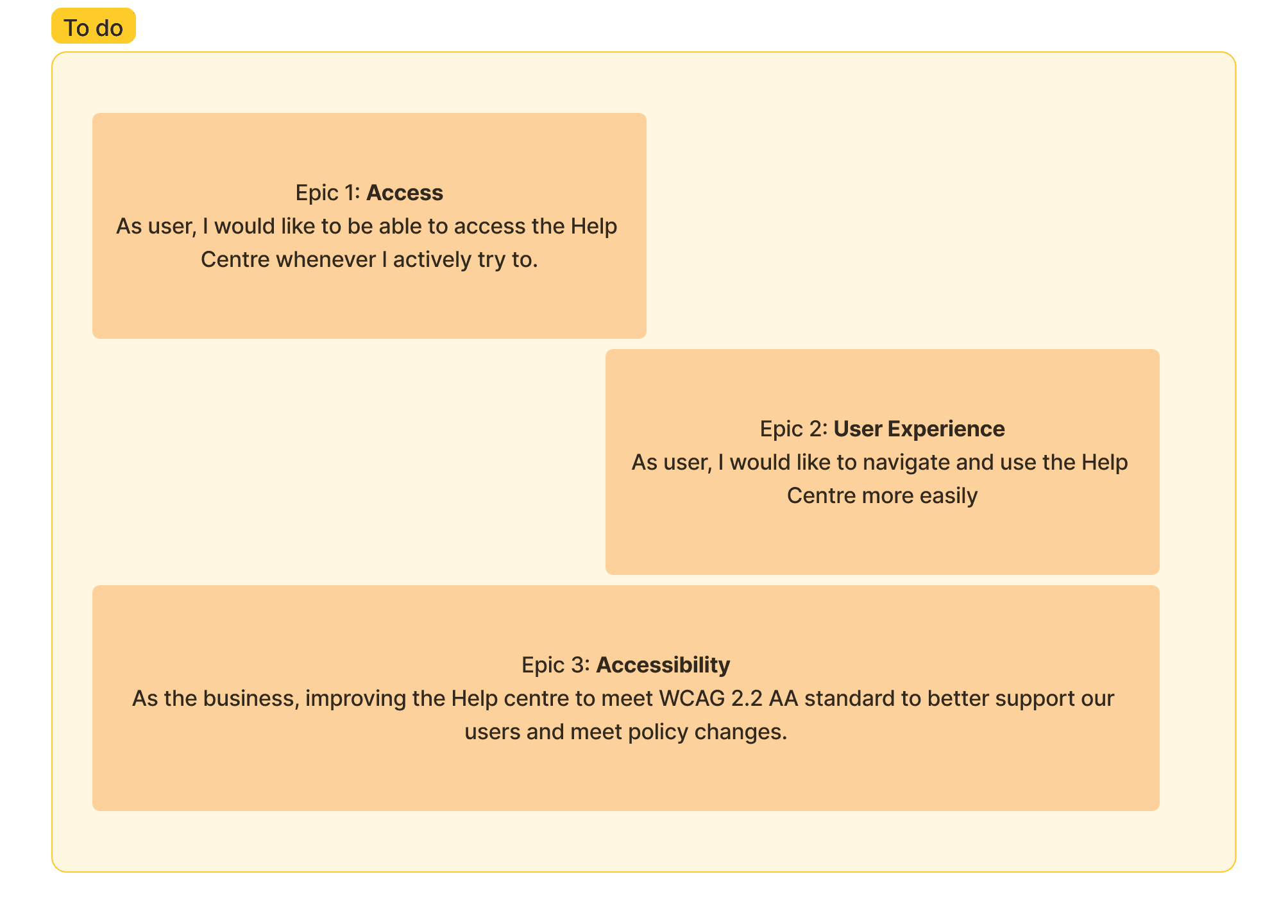
After team discussions that evaluated potential outcomes, opportunities, and the effort required, we defined three key epics and prioritized their implementation:
While improving accessibility is critical, it also demands significant resources from both designers and developers. To address this: Accessibility improvements were integrated into every step of the development process. However, strict adherence to WCAG 2.2 AA standards was deferred until the end of the design and development phases.
Once the feature was fully implemented, a comprehensive review against the WCAG 2.2 AA standards was conducted to identify gaps and calculate the additional effort required for full compliance.
This approach ensured that accessibility was considered throughout the project while balancing resource constraints effectively.
Experimenting and collaborating with Developers
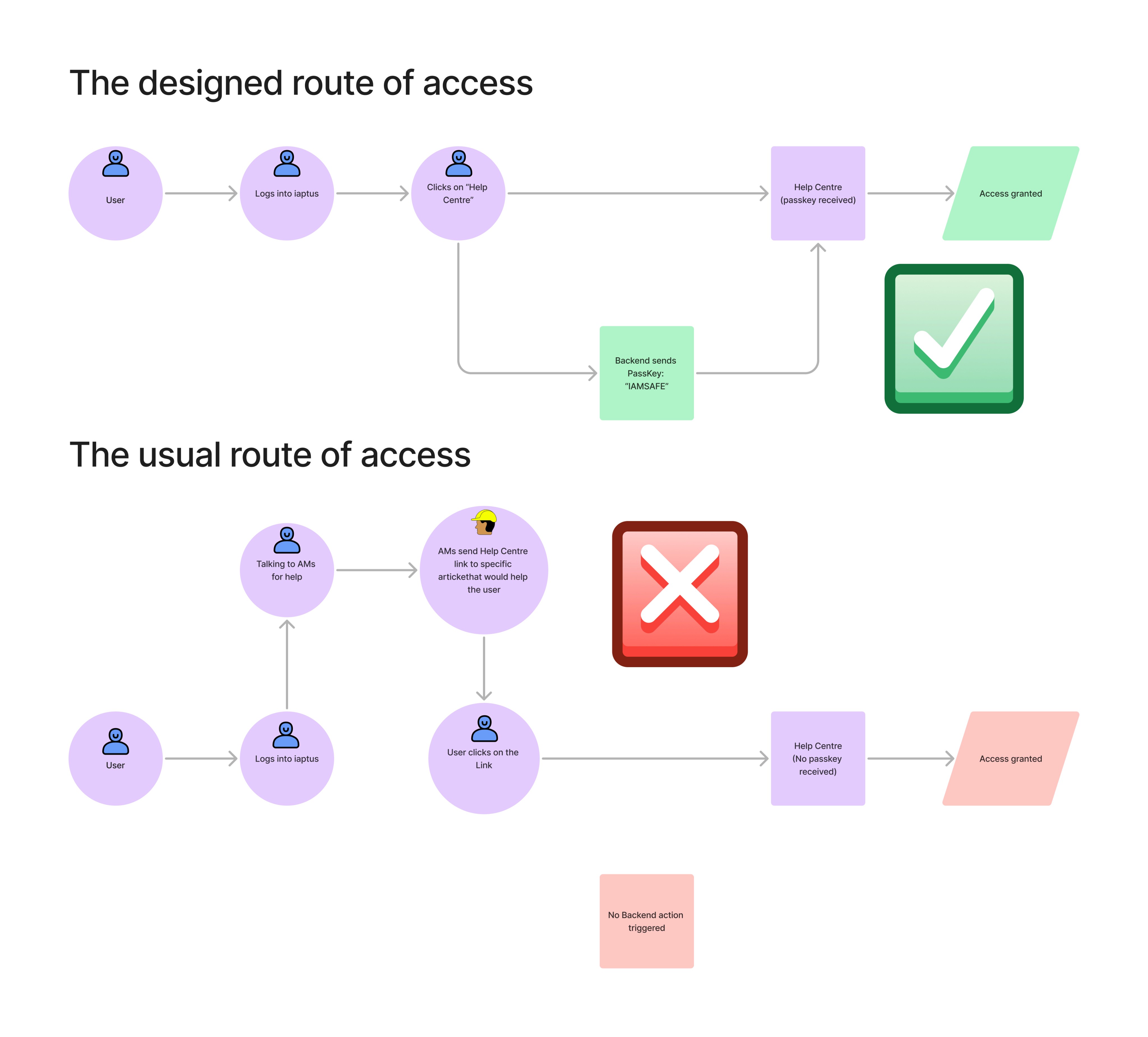
To uncover the problem preventing users from accessing the Help Centre, I collaborated with a developer and began experimenting with our product and the Help Centre. Through our investigation, we discovered that the Help Centre unintentionally blocks users from accessing its resources via direct links or search results unless they have recently clicked the "Help" button within our platform.
Quick win solution
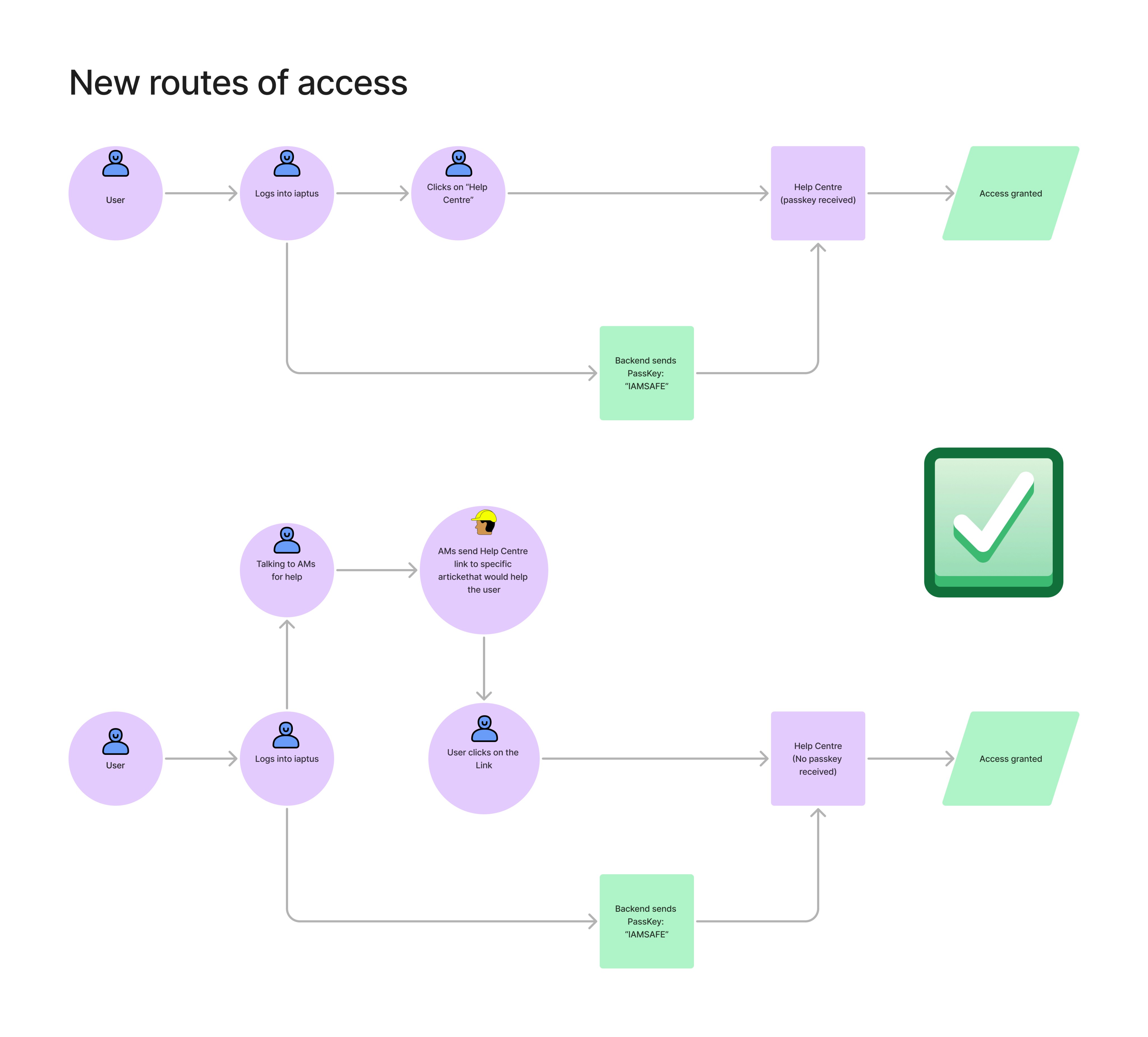
Once we mapped out the flow and discovered the issues preventing user access, developers were able to find a relative easy way to solve the problem without interfering with user experience.
Expected outcome and metrics tracking
With this change, we expect that users will be able to access the Help Centre when they need to. This hopefully will relieve AMs workload by users using more the Help Centre, or allowing AMs to solve users’ issue with one link only.
In order to verify the effectiveness of this change, we will track the following metrics monthly:
The change in page views in Google Analytics.
The change in amount of support logs raised by users.
Informal interview with AMs to see if they feel like send a link to help user is more effective than before.
Navigation and design
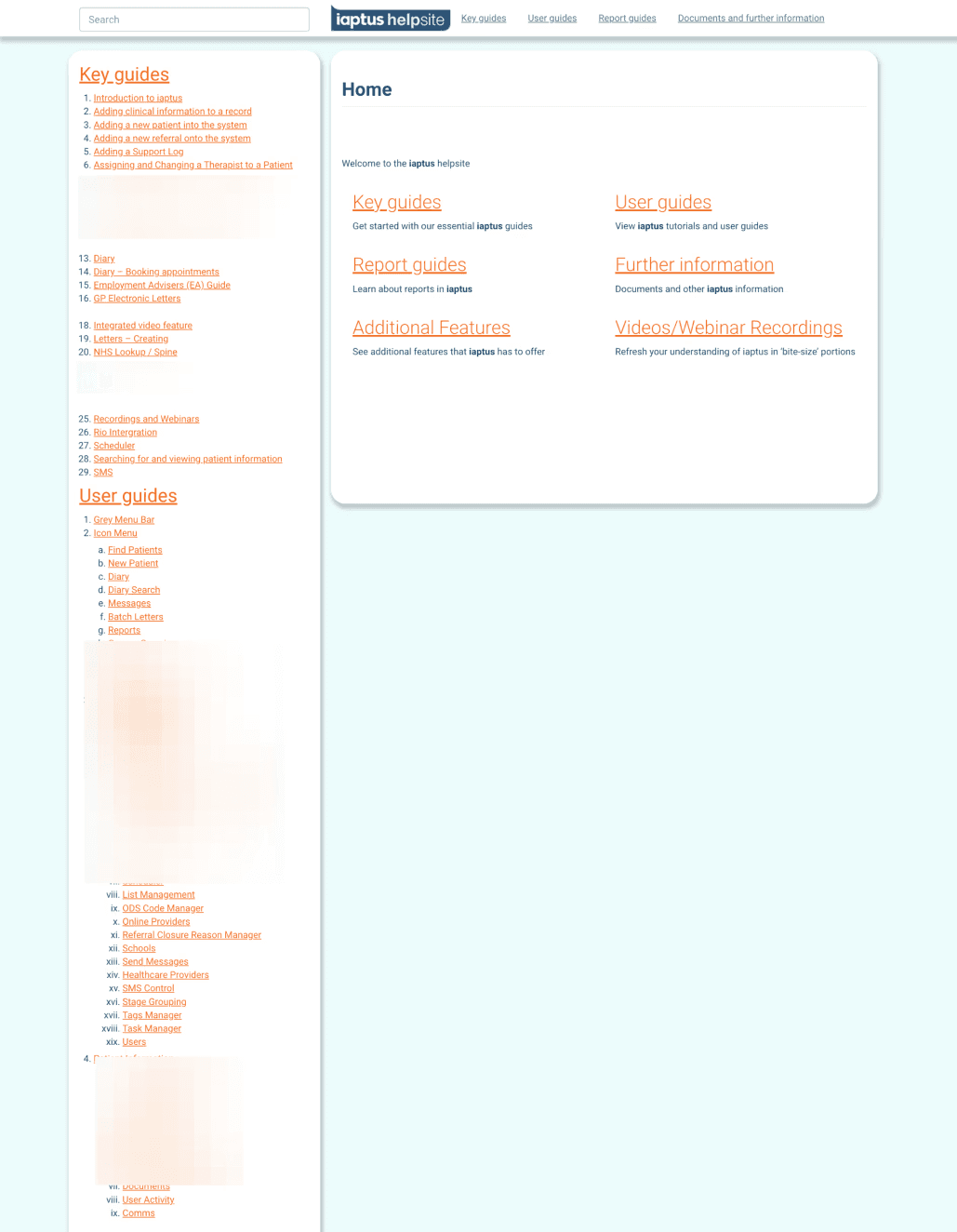
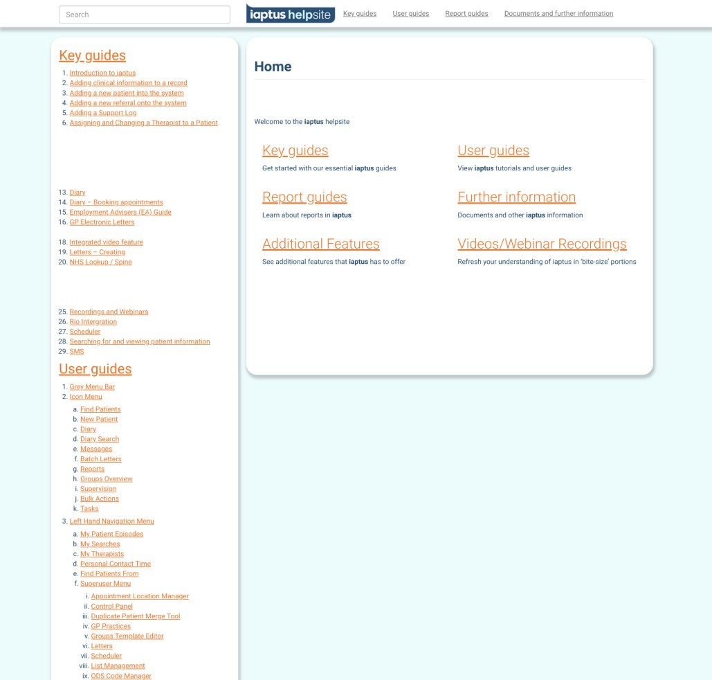
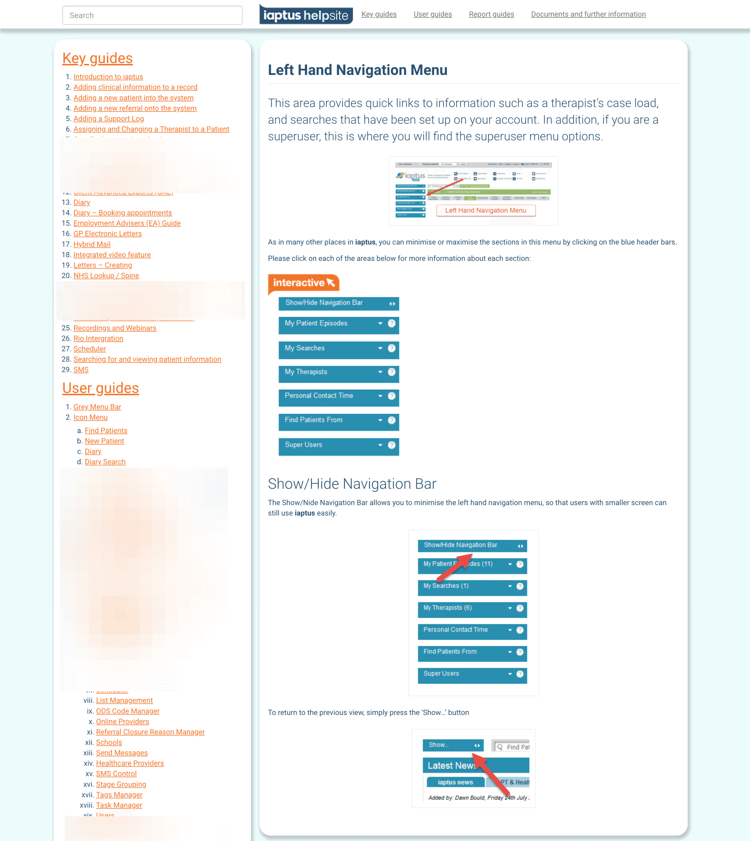
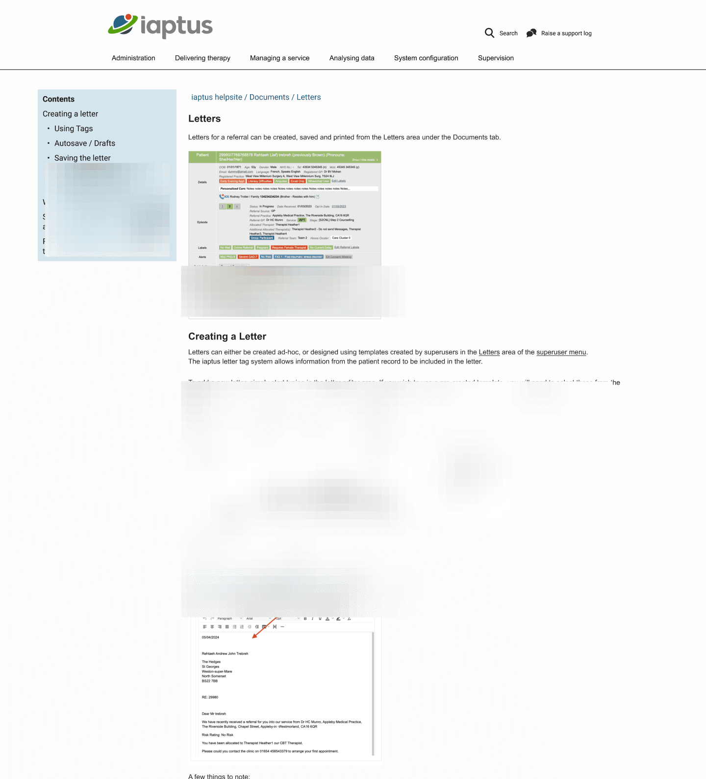
The previous Help Centre lacked a dedicated navigation system, instead presenting users with a lengthy, overwhelming list of article titles. Although some hierarchical structure was present, the layout and visual design made it difficult for users to locate the information they needed.
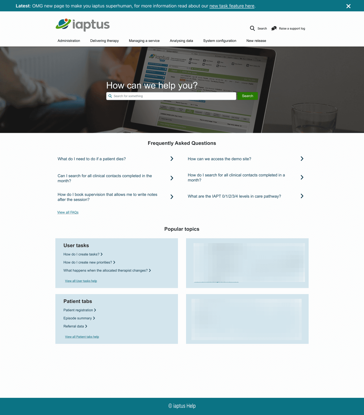
Our goal was to redesign the navigation to be intuitive and user-friendly, providing a clear structure that simplifies information discovery. Additionally, we aimed to create a clean, modern interface that aligns with user expectations and enhances the overall user experience.
Market research
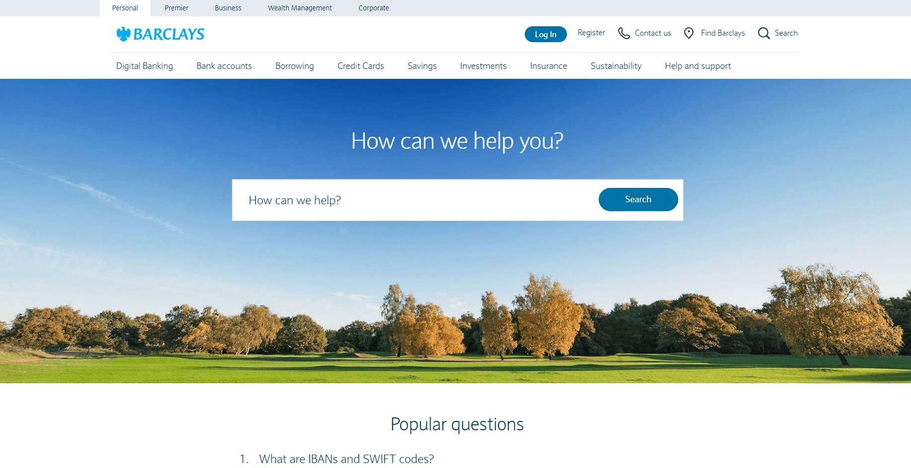
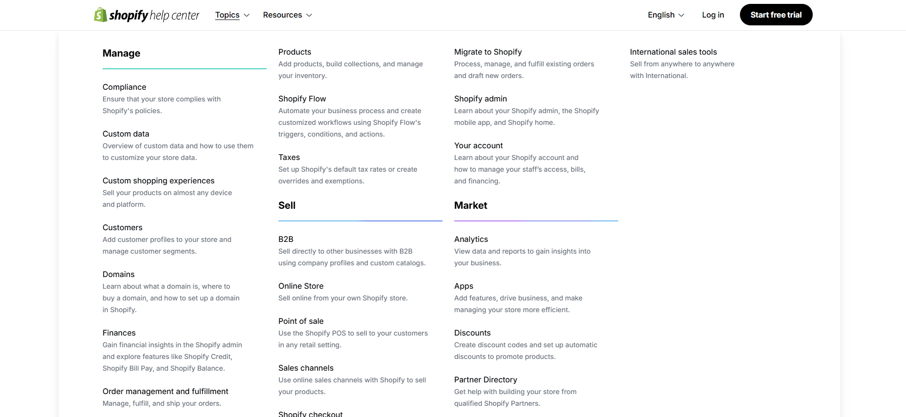
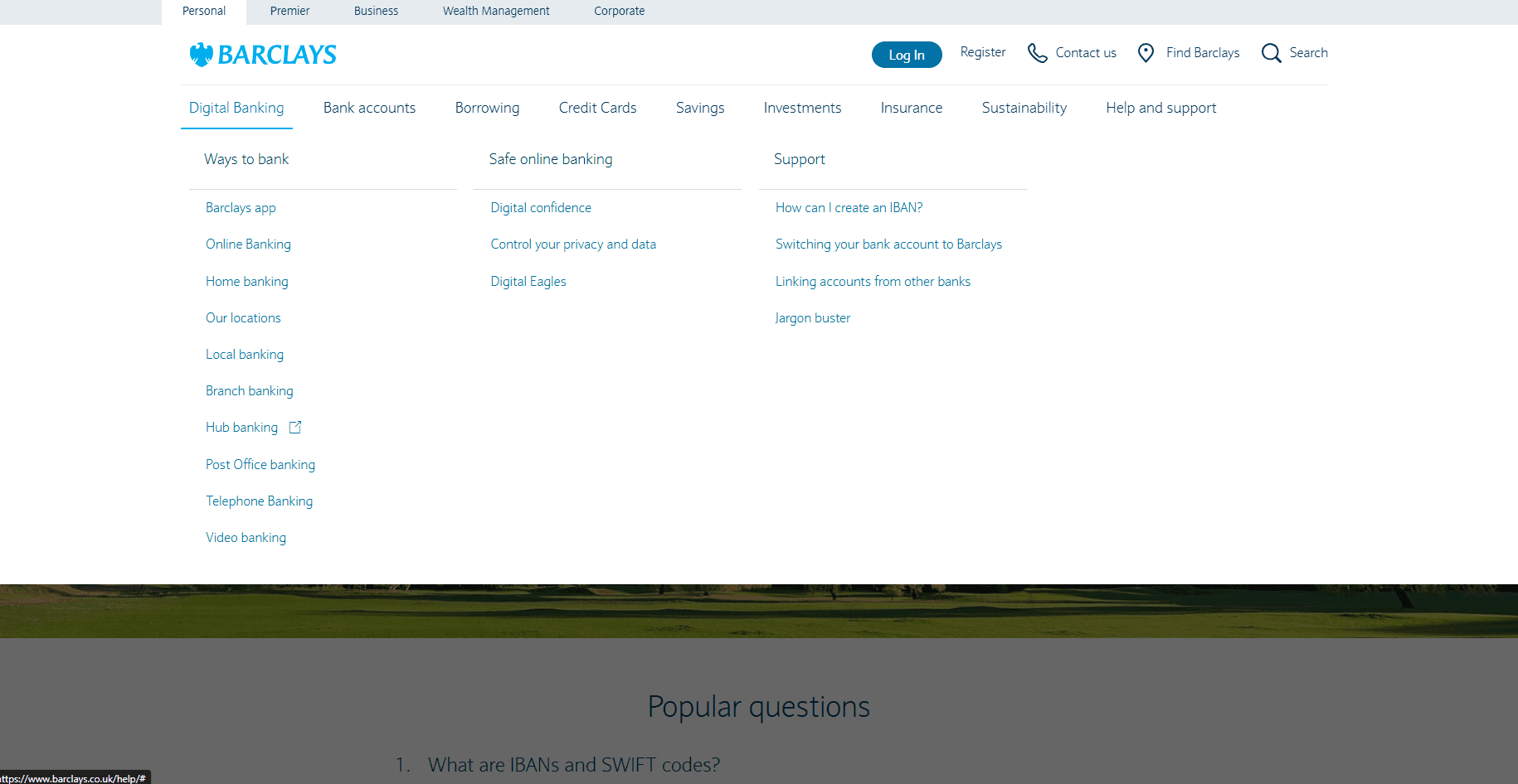
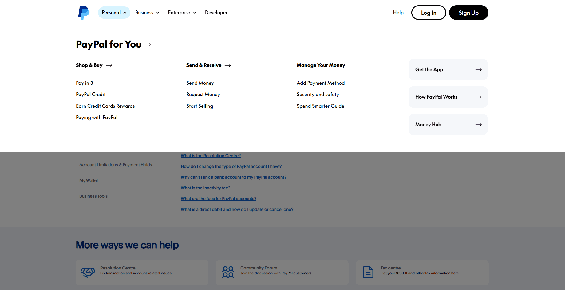
To determine the best approach for structuring our Help Centre, I conducted market research on the Help Centres of companies with similar characteristics:
Large volumes of content
Knowledge-based systems
Numerous categories and subcategories
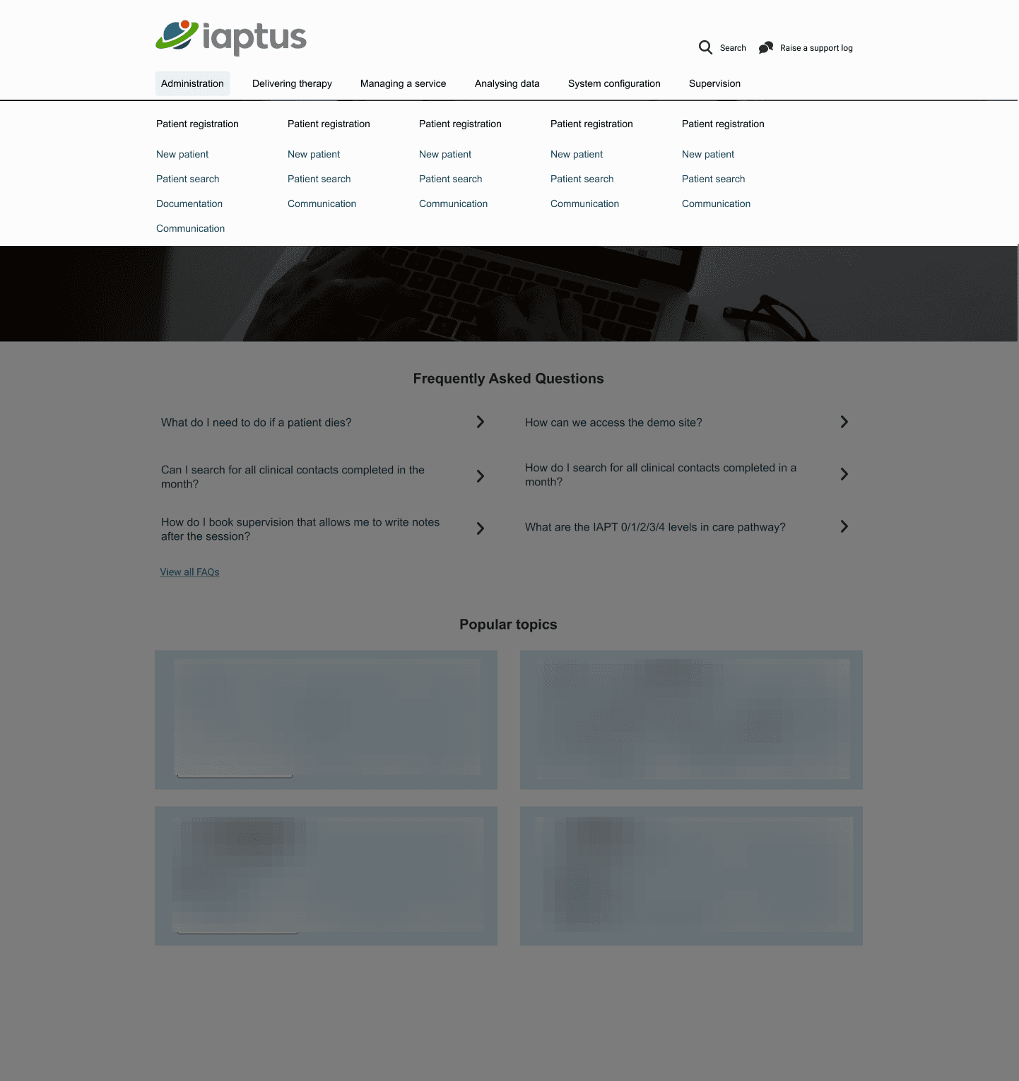
Based on these insights, a mega menu emerged as the most effective option for organizing our navigation. This solution allows for a clear, hierarchical structure that can accommodate our extensive content while making it easier for users to locate the information they need.
Information Architecture
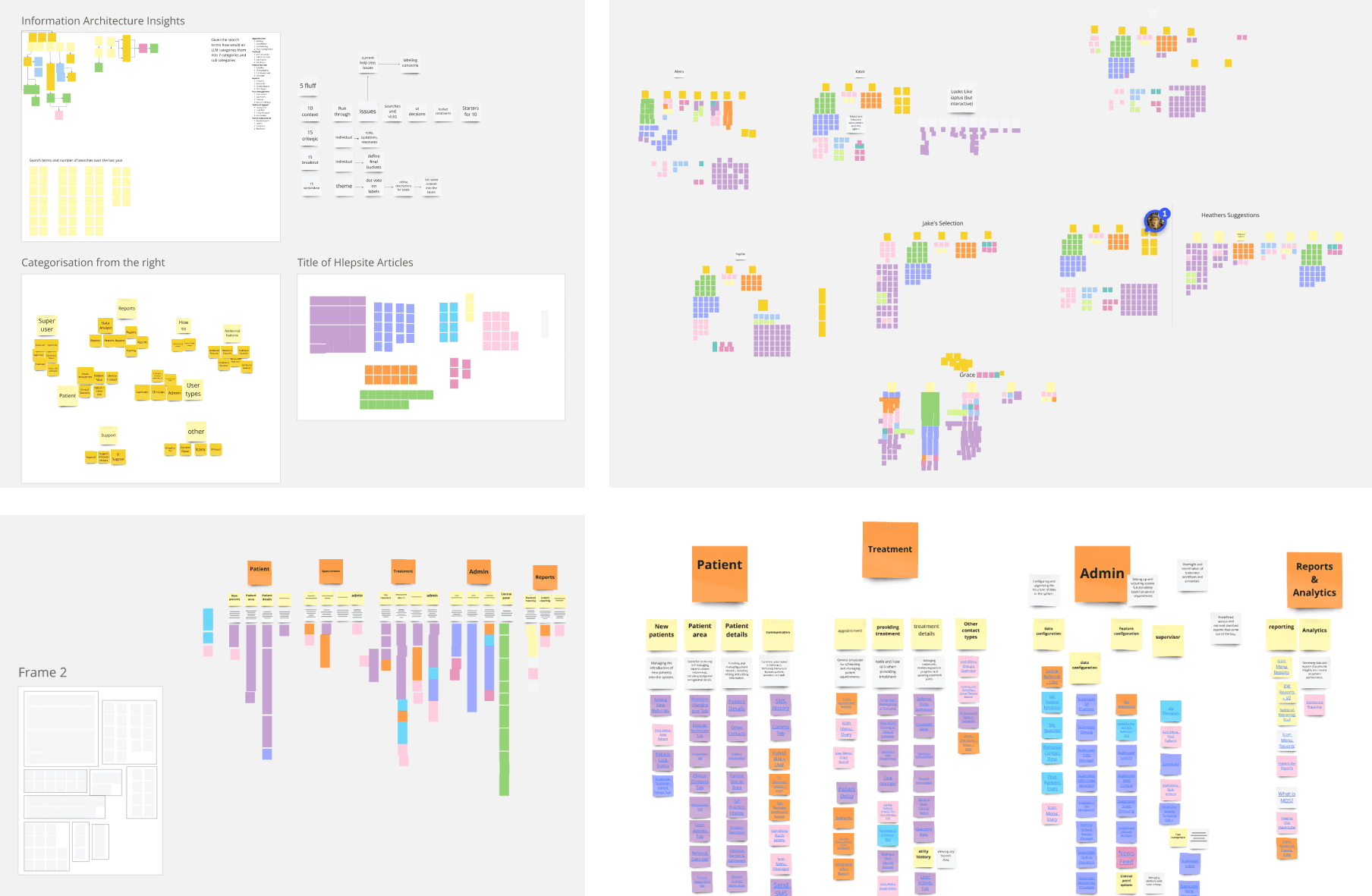
With the introduction of a new navigation system, it became necessary to redesign the information architecture (IA) to better support users in finding the information they need. To achieve this, we collaborated closely with Account Managers (AMs), who are the most frequent users of the Help Centre inside the company and have deep insights into client needs.
Our process included:
Informal Interviews: Gathering insights from AMs to understand user pain points and preferences.
Card Sorting Exercises: Organizing the large volume of content into logical categories and subcategories.
User Validation: Verifying the proposed IA with users to ensure it aligned with their mental models and expectations.
This collaborative approach helped us create an intuitive structure that enhances usability and makes content easier to discover.
Low Fidelity to High Fidelity
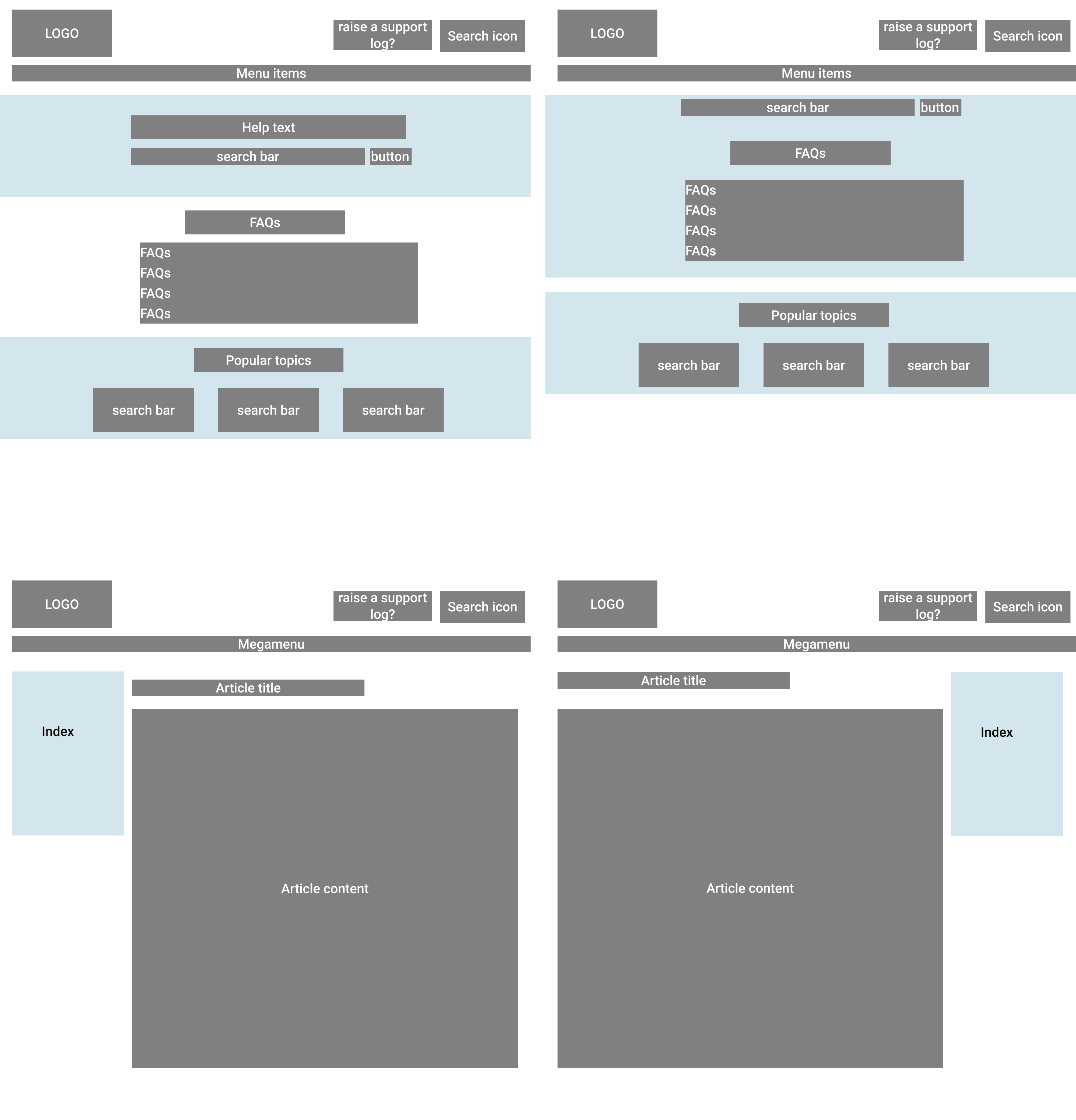
Guided by user feedback and industry best practices, I redesigned the Help Centre with a focus on addressing key user needs and improving the overall experience. The redesign prioritized:
A Prominent Search Bar: Recognized as a crucial tool for users to quickly locate information. This is further discussed with Devs to improve SEO.
Frequently Asked Questions (FAQs): A highly requested feature to address common queries efficiently.
Improved Navigation: A structured, user-friendly layout to simplify content discovery.
Visually Appealing Design: A clean, modern interface that is easy on the eyes and enhances usability.
This user-cantred approach ensured the Help Centre became a more effective and accessible resource for users.
Epic 3: Accessibility
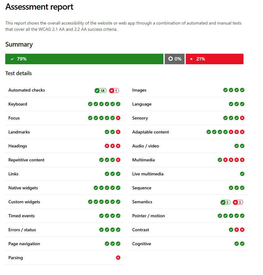
Accessibility Audit
To create a more accessible and inclusive Help Centre, I conducted a comprehensive accessibility audit. While accessibility was carefully considered throughout the design process, some gaps remain for full compliance with WCAG 2.2 AA standards.
For a detailed breakdown of the audit findings and recommendations, click here.
Further Accessibility Consideration
Following the accessibility audit, we addressed as many issues as possible, though the Help Centre is not yet fully compliant with WCAG 2.2 AA standards. Throughout the development process, I maintained close communication and collaboration with our WordPress developer to ensure quality and consistency.
Fortunately, WordPress offers built-in accessibility tools that helped us identify and resolve additional issues. With these resources and continued teamwork, we aim to further enhance the Help Centre’s accessibility and achieve full WCAG 2.2 AA compliance.
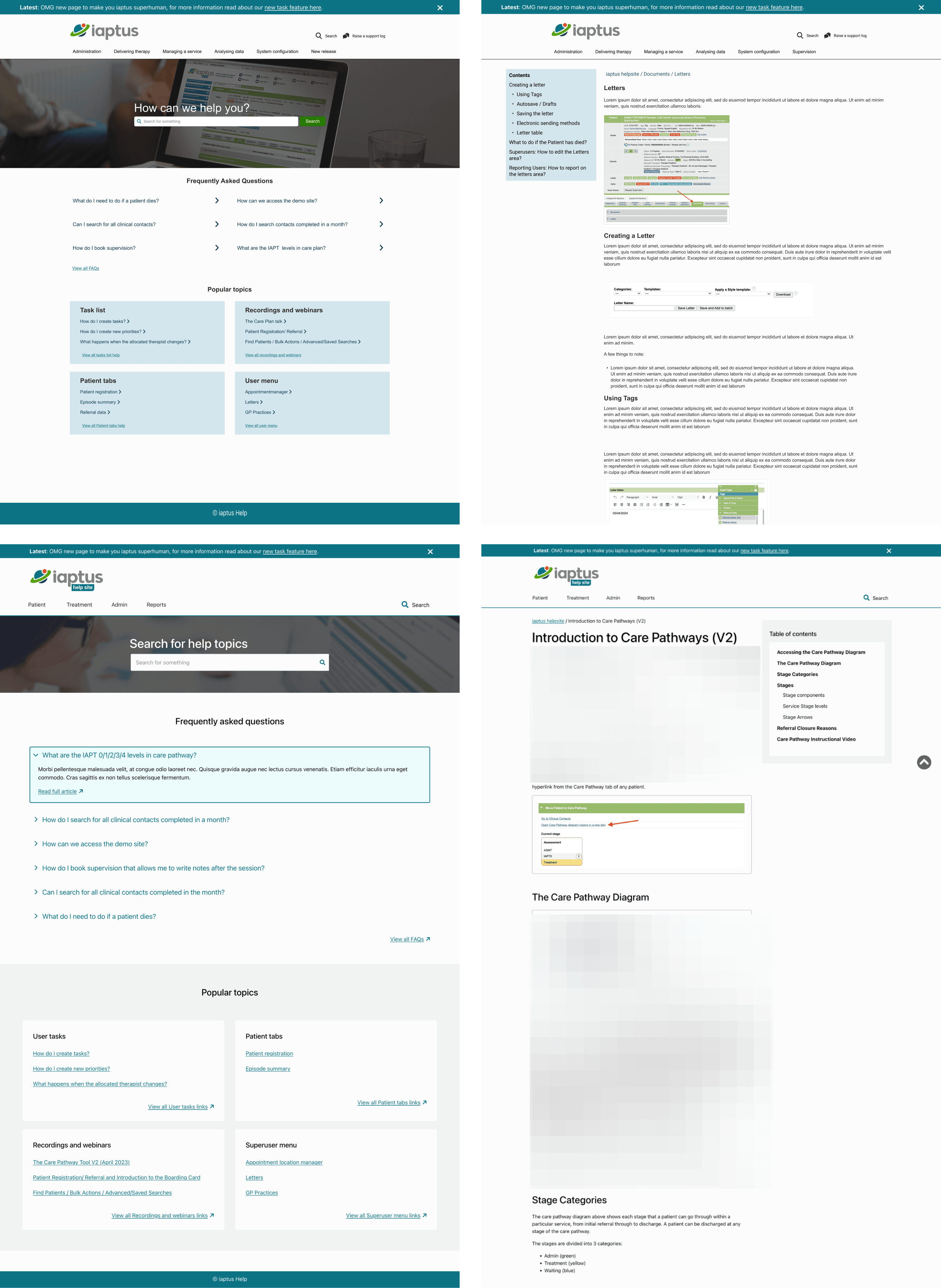
Results - Before and After
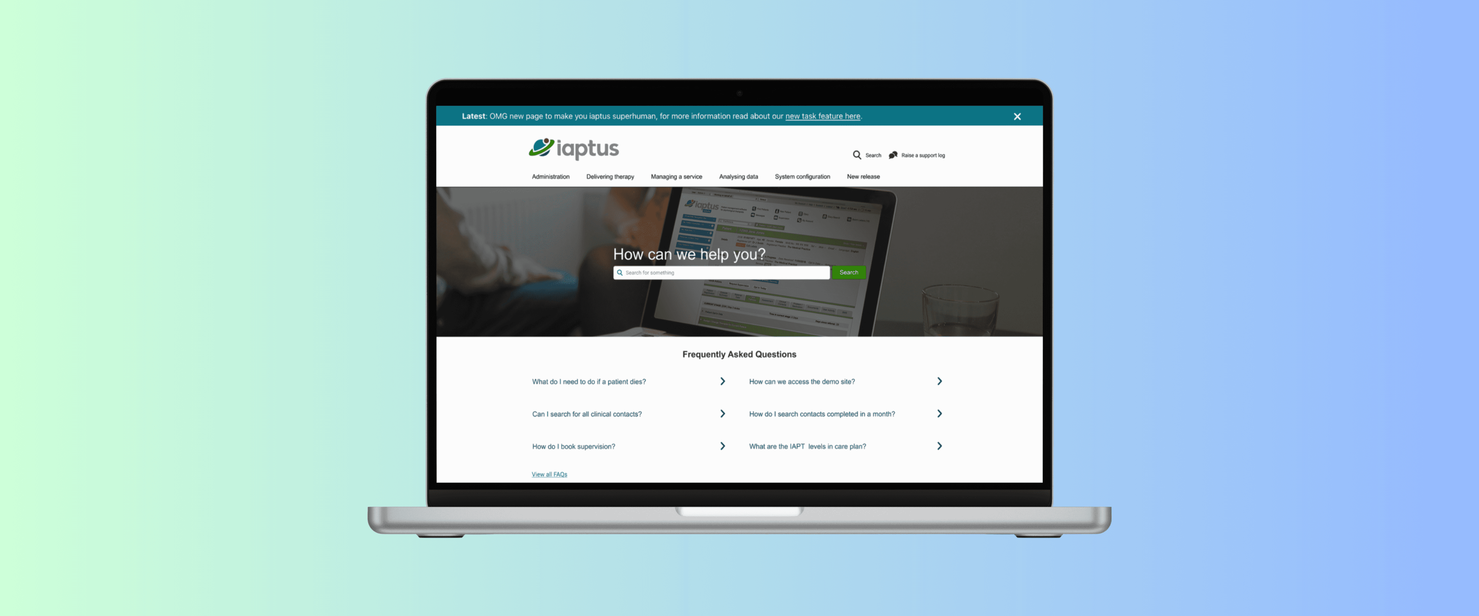
Home page - Before
Home page - After
Content page - Before
Content page - After
Next steps and iteration
To ensure a smooth transition and minimize disruption, we implemented a parallel site strategy during the pilot phase of the new Help Centre:
Maintain the Old Help Centre: The current Help Centre remains active to ensure uninterrupted access for all users during the pilot.
Controlled Testing: The new Help Centre is unlisted and accessible only via a direct link, allowing for controlled user testing with a targeted cohort.
Focused Feedback: While sharing the link might expand the audience, the pilot focuses on gathering feedback from a carefully selected group of users.
Further metrics and analysis
1. Content Selection:
Analysed Google Analytics data to identify the most viewed and frequently accessed articles from the old Help Centre. Curated a selection of high-value content to populate the new site, ensuring it meets user needs from the outset.
2. User Cohort Engagement:
Identified a group of engaged users, including those who had participated in previous surveys or frequently used the Help Centre. Sent these users a direct link to the new site, explaining the pilot’s purpose and encouraging them to use it for their support needs.
3. Feedback Mechanism:
Collected feedback on two key areas:
Success: How easily users found the information they needed and whether navigation felt intuitive.
Challenges: Content users couldn’t find and suggestions for improving navigation or content placement.
4. Analytics Integration: Connected the new Help Centre to Google Analytics to track user behaviour, including navigation paths, popular pages, and drop-off points. Combined analytics data with user feedback to gain a comprehensive understanding of pain points and opportunities for improvement.
Take aways
This project underscored the importance of user-centred design, iterative development, and data-driven decision-making. By leveraging insights from Google Analytics, user feedback, and stakeholder collaboration, we addressed key usability and accessibility challenges while ensuring the redesign met both immediate and long-term needs. The parallel site strategy minimized risk, allowing us to gather valuable feedback without disrupting existing users. High adoption rates during the pilot phase validated the effectiveness of our approach, while the focus on scalability and continuous accessibility improvements ensures the Help Centre will remain a valuable resource for all users.
Thank you for reading my project
Looking forward to collaborate with you!
